Lots of fun , new things to show on my blog this Nov
( i did hint ! )
and here's one of 'em -
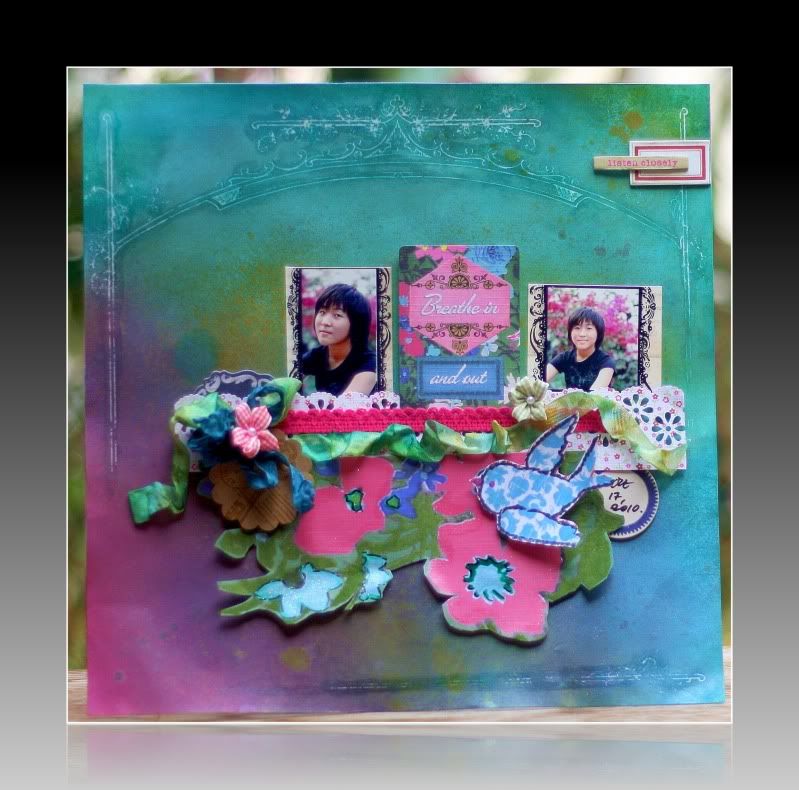
I'm one of the challenge guest designers for November over at KCK's blog .
Check out all the details here .
And all the different inspiration projects using GCD Studios lines.
And all the different inspiration projects using GCD Studios lines.
Working with some of the GCD Studio's Homespun Chic line,
here's the inspiration project I came up with !
I shared some details on creating this layout
over at KCK's blog - you can check it out here .
Let me just share a tip or two here,
that I discovered in the creative process .
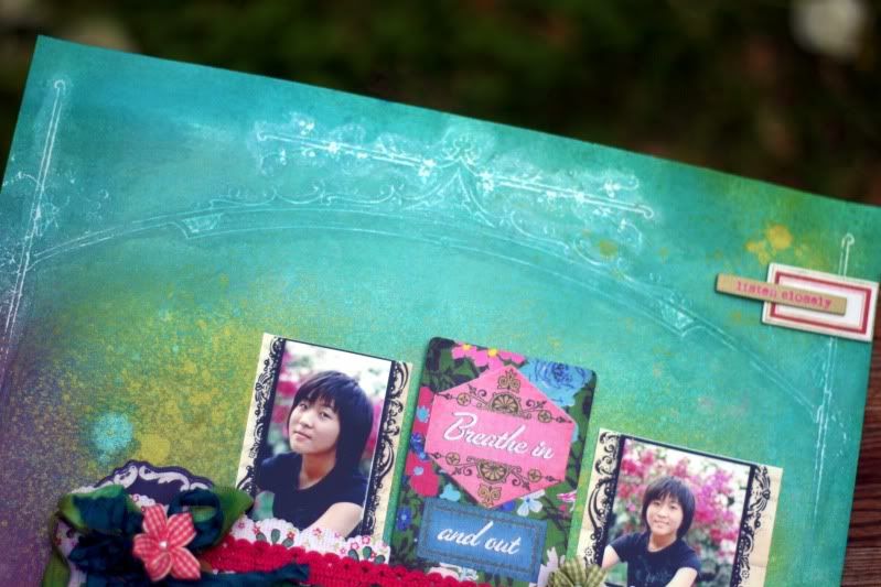
My glimmer misted background uses the
Parisian Anthology paper called Architectural Arch.
After the background was dry from misting,
I used a wet wipe to go over the resist ink
- making sure that it shows up better
When I wasn't satisfied enough with that ,
I simply went over the resist ink with
Chandelier Glimmer Glam (colorless but with lots of lovely glitter)
And the result is just delightful to me -
where the Chandelier Glam went over the misted parts ,
the colors intensified , a little glitter was left behind
and the resist ink showed up the way I like it !
Another tip :
While I do have a coupla of bottles of mists by now ,
there aren't too many that I've reached almost the end of it .
However, the Apple GM ( from the TA Fall 2010 Limited Edition line) is one of them.
When there isn't much mist in the bottle,
I realised that the GM simply comes out rather heavy -
close to a splattered effect even !
I don't mind it at all for sure !
love the extra textured effect ! lol .
But if your bottles of mists are always full, you say ?
pour out 90% of it , & try misting with the 10% left in the bottle !?!!
then pour it all back ! ack !!!
( open to S'pore & M'sian crafters )


10 comments:
Wow...the queen of mist is at it again;-D
Well done on a gorgeous layout.
That background is just devine!!! Gorgeous work Pearl!
xxx Peggy
This is definitely your line Pearl...tell me, are you saying that the mists may squirt better if they are not so full? If so I can try that as I have a couple of mini-mister bottles. This layout is too cute. I love this line. Have some Artsy Urban myself so can play along with this one - woohoo!
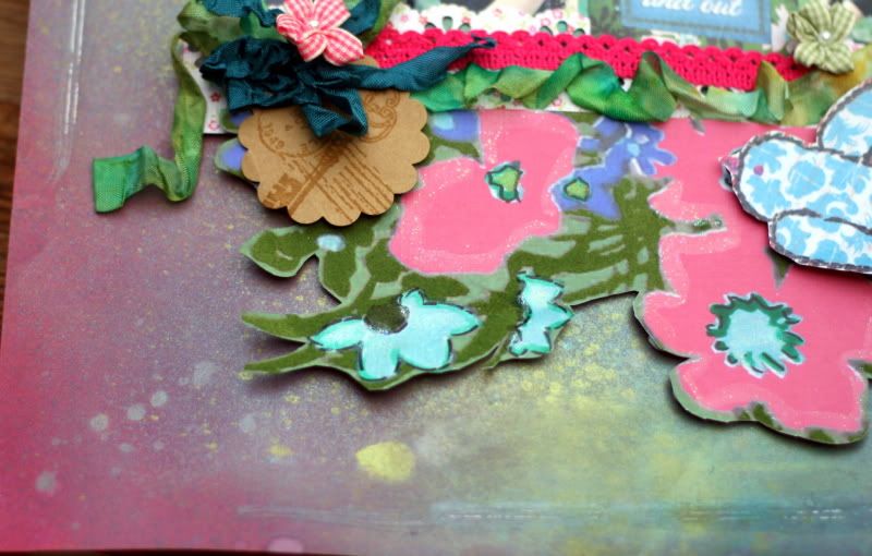
another as you sAY delish LAYOUTS, LOVE THE GLITTERTY EFFECT YOU have ACHIEVED around the flowers cut out!!
What a gorgeous page, Pearl! Congrats on your special guest DT this month! That is just awesome!
LOVE your misted background. You do so well with the misting. I love the layers of colors and the added splotches. Very cool technique to try with the empty bottles. I just love the bird and the cut flowers, too. Beautiful!
ANother wonderful page!! The background turned out amazing and the fancy cutting is great!! :) Congrats on another GDT spot!!!
You are just all over the place, aren't you?? The misting is fantastic!!!! love love love the gorgeous and deep colors you created. Is the paper warpy? I just can't handle that very well! sigh...
Tooo cool and oh so artsy! cherry
Congrats! This is one amazing project! Woohoot! U are really good with your mists!
Thanks for sharing your wonderful skills with mediums at KCK and the shout-out for Challenge #3.
Post a Comment